Thursday 12 December 2013
Thursday 28 November 2013
Kayleigh McCallum
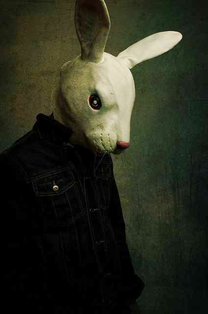
Kayleigh McCallum's collection of photographs called 'anti-fashion' use a lot of shadow and contrasting tones between the white mask and the surroundings.
I really like the 'grunge' background as it looks
distressed, adding to the freaky look of the photo.
Some of the body positions are strange which looks very interesting, whereas this one is quite simple and natural, which also is very effective.
Tuesday 26 November 2013
Skeleton flower
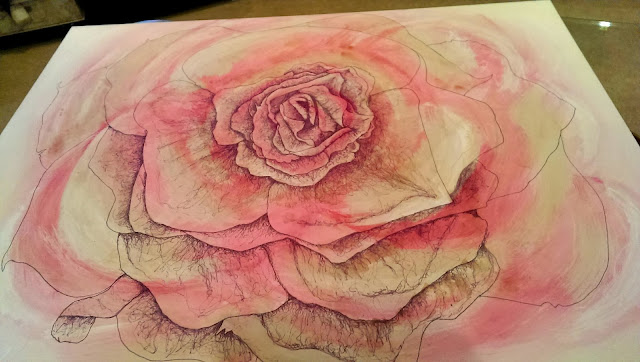
For the continuous line drawing of a rose, I have now started to add some dusky tones to darken the pink tones.
I'm not a fan of tea stain, but I thought it was the most effective way to get this look I wanted.
It also will add more depth...
Monday 25 November 2013
Hanna Lovinda
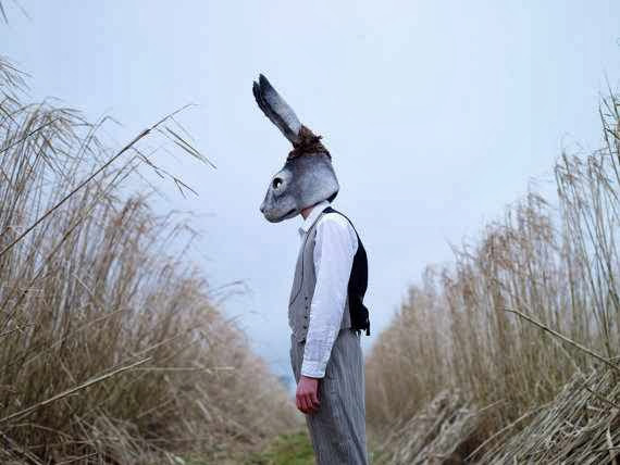
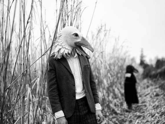
For my project in photography 'Body Parts' I want to look at de-facing people or disguising them. I first looked at using films in the dark room and manipulating them, by either covering up people's faces (like a mask), or using techniques such as the burn tool.
Now I want to look more into masks, or ways in which you could incorporate disguises with fashion photography.
I like this idea of taking away the faces of people because it adds an element of the unknown which adds a lot of interesting feautures to the photograph, because people always want to know what facial expressions people have. This is how we know how others are feeling.
I would like to experiment with this idea in my own project, but maybe add the element of fashion because I think it works quite well using pretty dresses/ clothes with weird and animalistic masks, as it adds juxtaposition. You can see this when you look at the bride in the photograph alone.
Photo taken from Hanna's blog
Friday 22 November 2013
Mechanical Body Parts - Photographs
Cylinder head
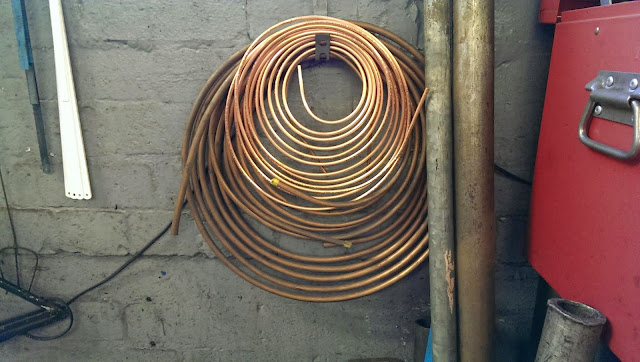
A roll of brake pipes
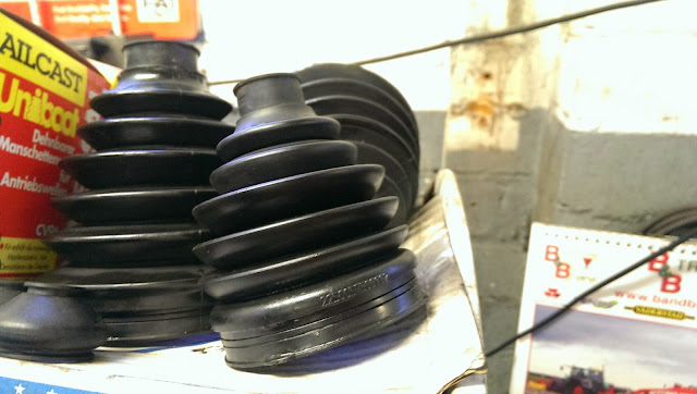
Rubber seals
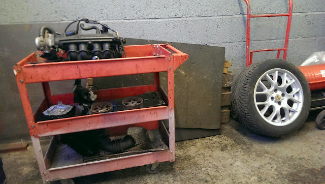
Tool trolley
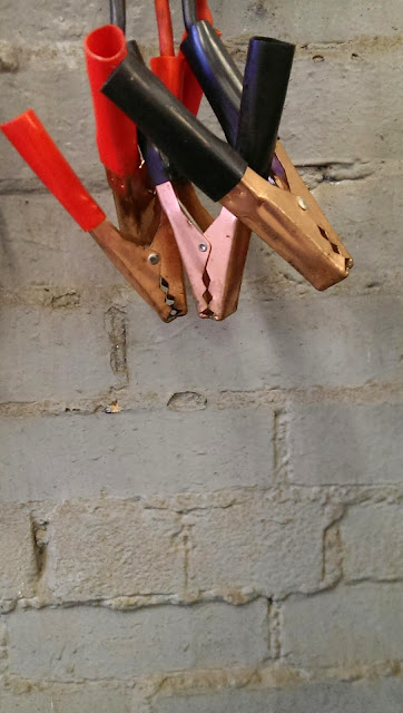
Jump leads
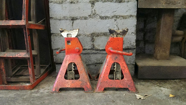
Jacks
Here are some photographs that I took whilst walking around my dad's garage. I liked looking more closely at things and seeing interesting shapes with the parts.
The rustic and dirty look of the garage adds to the whole feel of the objects I photographed, as they are quite old and rusty.
Monday 11 November 2013
Recording my flower
I also recorded my flower broach by photographing it on different backgrounds and in different lighting. 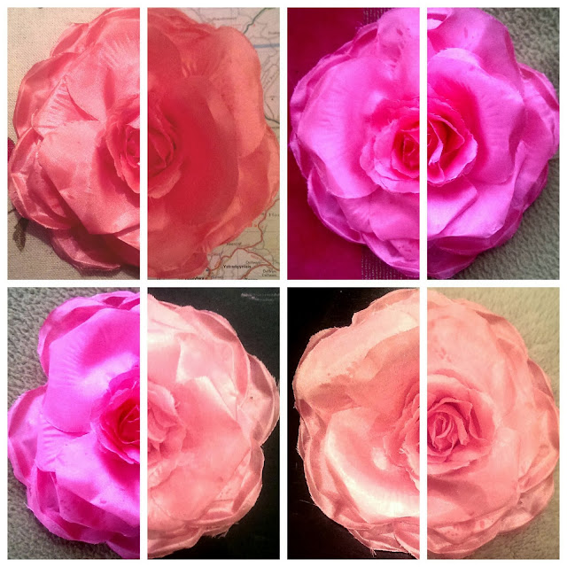

I used my mobile to arrange my photographs, starting with merging two photographs together to look like one. I like how the colours change due to the different lighting in each room of my house. Plus the range of backgrounds give the photos another element of interest.
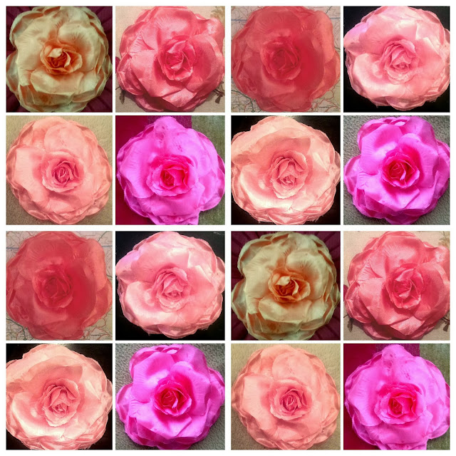
Here I put all the photographs I took together in a uniformed collage. I like how it looks symmetrical, even though it is not, and the different photographs compliment each other and create an overall evenly distributed range of tones.
Skeleton flower - Henry Moore Style
During the experimental stage of the course I looked at an object that interested me. I chose a flower broach and recorded it in different ways. I like the idea of sketching the outline of it firs (like a skeleton drawing), then filling in the tone using 'doodly' type lines. Like Henry Moore does in his work.
In my sketchbook I experimented putting different materials or patterns or colours underneath these drawings. I preferred muted tones of the actual flower (concentrating on darker and lighter tones), as it seemed to add to the depth of the drawing. It also seemed to match up with the fineliner drawings i did over it...
Above, I tried to add different colours into the fineliner drawing, and found that it looked better when I kept it to a minimum, especially if I was going to put blocks of colour underneath.
Above, I have already recorded the tones of the flower in pinks and whites, but kept it very muted so that it doesn't overpower the drawing. After that I drew the outline of the flower and have started to fill in the tones in a Henry Moore style. I think the finished drawing will be very effective.
The drawing will be posted when finished.
Sunday 10 November 2013
Head to head - Big Draw
For the big draw I changed A paper bag to make it look like a head. I chose an animal (tiger) and used coloured pencils, graphite and felt pen.
The bag needed look like someone's head if they wore it, so I chose to make it so it could be worn on the front of the face, instead of the usual way of just putting over the peron's head. (like a mask).
It looks quite bold and the fact the tiger is roaring makes it stand out even more. It obviously looks most effective if the person stands sideways on...
Monday 28 October 2013
Slice
3D design - Transform
I was given a word (slice), and then had to interpret that word in my own way, then create a 3D representation of my word.
I came up with the idea of imagining what certain foods would look like if had taken a slice (or shaving, slither or cross section) from it. I stuck to sandwiches, teas, buns and glasses of pop.
I tried to keep to certain colour themes and the original colours of the actual foods. I also did double-sided cross sections so it would look more realistic. I then used a strip of plastic to support the objects.
The objects were arranged in size (smallest to largest) and were cut into to fit into the slot in the plastic.
After I looked at the finished result, I thought that the gaps between the objects was too large and didn't get the effect I wanted. So I then tried to imagine what it would look like with some food related objects inbetween them.
I needed the objects to fill in some gaps, and also gradually build up the height.
I stuck to cutlery and crockery to fill in the gaps and link to the food idea. It looked much better and more filled out. It also showed off the height increase.
Below is the finished outcome which I am very pleased with. If I had some more time on the project I would have probably took the time to make more cross sections of food to fill the structure out even more. But the bendy plastic may have snapped if I cut more slots into it, weakening it each time.
Wednesday 23 October 2013
Tube within a tube
Wednesday 16 October 2013
Hugh Lippe
These series of photographs stood out to me, mainly because of the strange surroundings. I like outdoor photography, especially when it involves a model, and I think photographs look good when the monochrome tones are deep, such as these.
The photograph above uses repetition and an offset composition very well. It's quite striking with the contrasts between the models' skin, the backdrop and the white feathers in their hair.
I have always loved fur within a photograph because it adds another element to the scene and creates textures.
Also the backdrops appeal to me because it creates another layer to the composition, rather than it just being the model in the foreground, and the vast landscape in the background.
Thursday 10 October 2013
Henry Moore
Fine Art - Transform
This is a good example of including negative tones (the spaces around an object) and how it adds a lot of depth to an image.
Henry Moore has a distinct style of drawing, using layers of doodle-like lines, which gradually builds up tones.
Tuesday 8 October 2013
Nate Parker
Fine Art Photography
I found Nate Parker's work whilst searching for fine artists that use monochrome widely in their work. As soon as I saw one of his photographs I fell in love with the vast detail, deep monochrome tones and memorable landscapes. He uses a lot of water in his photographs, and makes it look like fog by using 'slow photography', something I've never seen in these types of pictures. It looks beautiful, almost like it's not real.
I found Nate Parker's work whilst searching for fine artists that use monochrome widely in their work. As soon as I saw one of his photographs I fell in love with the vast detail, deep monochrome tones and memorable landscapes. He uses a lot of water in his photographs, and makes it look like fog by using 'slow photography', something I've never seen in these types of pictures. It looks beautiful, almost like it's not real.
'Old Scow'
'Otter Cliffs and Wave Patterns'
'Ruby Beach Gull Rock'
"I live on Mount Desert Island, Maine, home of Acadia National Park and where the sun rises before anywhere else in the US. Landscape photography has been a passion of mine as long as I've been living in Acadia, since the year 2000. It provides an opportunity to really appreciate nature and get away from the hustle bustle of the real world. My process is a "slow photography" where in 2 hours probably only a few or a dozen exposures will be made, that provides the chance to really "see" what is there and let the scene reveal itself. I'm constantly finding new scenes to shoot along the incredibly dynamic coastline of Maine and in Acadia National Park" - Nate Parker www.nateparkerphotography.com <<Have a look.
These shots make me want to try this out for myself, I love it!
Monday 7 October 2013
Expressing forms using shoe polish
Fine art - Transform
I transformed a strip of paper into a different form by using crease and folding techniques.
This is what I made. I don't really like straight crisp edges or folds, so I opted for a more organic shape.
I then tried to record the shapes and surface type onto a different strip of paper using shoe polish. Firstly (left), I used a stencil technique, covering certain places up with masking tape and applied the polish with a toothbrush.
Secondly (middle) I incorporated some scratch marks, which then the polish stuck into which I thought created some interesting contrast and patterns.
Lastly I used collage material (masking tape) to create the surface textures. I like the scrunched up effect, but it doesn't have much contrast compared to my first attempt.
Saturday 5 October 2013
Sunset beauty
I took this photo on my small digital camera whilst walking back to the cottage at sunset. The ruins of a castle on the right and the small fishing boats, all reflected onto the harbour.
Sophie Calle
Fine Art - Transform
The Hotel, Room 47, 1981
This piece by Sophie Calle, 1981 consists of photographs and text recored at the time of work between Sunday 22nd Feb 1981 to Tuesday 24th in a Vinetien Hotel. She photographed and wrote about what she had discovered in a series of twelve hotel rooms on the 4th floor.
"Calle is unashamedly voyeuristic, reading diaries, letters, postcards and notes written or kept by the unknown guests, rummaging in suitcases, and looking into wardrobes and drawers. She sprays herself with their perfume and cologne, makes herself up using the contents of a vanity case, eats food left behind and salvages a pair of women’s shoes left in the bin. Outside the room, she listens at doors, recording the occupants’ conversations or any other sounds she may overhear, and even peers into a room when the floor-waiter opens the door to catch a glimpse of the unknown guests." - www.tate.org.uk
I quite like pieces of work that are factual and documented, because it gives the viewer/ reader the feel that they are part of what is happening, or is being told a story. I did a project nearly two years ago which consisted of a book, filled with photographs of objects that appear in my everyday life. The objects that made me feel good and relaxed were in colour. This concept reminds me of Tucker Shaw, who recored and photographed EVERYTHING he ate over the space of one year, then made it into a book, 'Everything I Ate - A year in the life of my mouth'. -Have a look!
Cornelia Parker
Fine Art - Transform
The thing I love most about Cornelia Parker's work is that it is suspended, some just above the ground almost giving the illusion that you could walk on it.
The thing I love most about Cornelia Parker's work is that it is suspended, some just above the ground almost giving the illusion that you could walk on it.
'Neither From Nor Towards'
"consists of the bricks of a house that was situated on the cliffs of Dover. When the house collapsed due to cliff erosion the bricks fell down onto the beach below. They were then worn down by the sea."
She also uses shadows to give her work another dimension.
Cold Dark Matter; An Exploded View (1991)
Probably her most well-known installation was made by Cornelia Parker placing an assortment of car boot sale items in a shed, then asking the British Army to blow it up! She collected the debris and suspended it within the room to recreate the moment the shed erupted. A light is installed within the shed so that the wood and items were shadowed onto the walls, floor and ceiling.
I love this piece, it really feels as if time has stood still and you can see the very moment that this shed blew up.
Annette Messager
Fine Art - Transform
A french painter, sculptor and photographer, Annette Messager's work drew up on everyday life, "taking such subjects as toys and needlework. She usually used a range of closely related found-objects, as well as creating performance pieces. In her work she questioned accepted perceptions of women." - www.tate.org.uk
Half of an installation first shown at the Musée Nationale d'Art Moderne, Paris, now in Tate Modern. It consists of more than one hundred poles or spikes, 'pikes', each of which impales or supports an object or image.
"Little bodies made out of a combination of doll parts, stuffed limbs, headless torsos and internal organs are enclosed in sections of stocking, or pierced by many coloured pencils and hung with drawings of torture instruments and victims. Other pikes bear pastel drawings of limbs, corpses and figures of despair as well as fragments of maps showing various contemporary political entities in Africa, Europe and the Middle East." - www.tate.org.uk
The 'pike' has a paricular link to the political turbulence in France, and gives a sinister feel when you know the story behind it, as they were used to bear the guillotined heads of the aristocracy during the popular uprising, known as the Reign of Terror, during the French Revolution. I like how a lot of her works are suspended. It gives the impression that she feels she is allowed to express herself and her thoughts freely.
A french painter, sculptor and photographer, Annette Messager's work drew up on everyday life, "taking such subjects as toys and needlework. She usually used a range of closely related found-objects, as well as creating performance pieces. In her work she questioned accepted perceptions of women." - www.tate.org.uk
"Little bodies made out of a combination of doll parts, stuffed limbs, headless torsos and internal organs are enclosed in sections of stocking, or pierced by many coloured pencils and hung with drawings of torture instruments and victims. Other pikes bear pastel drawings of limbs, corpses and figures of despair as well as fragments of maps showing various contemporary political entities in Africa, Europe and the Middle East." - www.tate.org.uk
The 'pike' has a paricular link to the political turbulence in France, and gives a sinister feel when you know the story behind it, as they were used to bear the guillotined heads of the aristocracy during the popular uprising, known as the Reign of Terror, during the French Revolution. I like how a lot of her works are suspended. It gives the impression that she feels she is allowed to express herself and her thoughts freely.
Much of her work is a little more light- hearted...
'I like to tell stories… children’s stories are monstrous' - Anette Messager
This explains why much of her work is based on childrens' toys and childhood over the past four decades.
Subscribe to:
Posts (Atom)
