Thursday 28 November 2013

Kayleigh McCallum

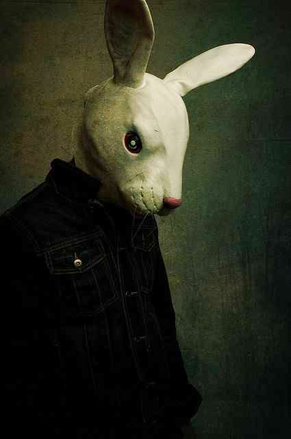
Kayleigh McCallum's collection of photographs called 'anti-fashion' use a lot of shadow and contrasting tones between the white mask and the surroundings. 
I really like the 'grunge' background as it looks
 distressed, adding to the freaky look of the photo. 
Some of the body positions are strange which looks very interesting, whereas this one is quite simple and natural, which also is very effective. 

Tuesday 26 November 2013

Skeleton flower

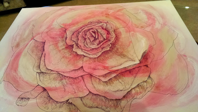
For the continuous line drawing of a rose, I have now started to add some dusky tones to darken the pink tones.
I'm not a fan of tea stain, but I thought it was the most effective way to get this look I wanted.
It also will add more depth...

Monday 25 November 2013

Hanna Lovinda


For my project in photography 'Body Parts' I want to look at de-facing people or disguising them. I first looked at using films in the dark room and manipulating them, by either covering up people's faces (like a mask), or using techniques such as the burn tool.
Now I want to look more into masks, or ways in which you could incorporate disguises with fashion photography.


The above photograph stood out to me because the people in the photographs are standing normally and acting as most people / friends do when huddling for a group photograph, (even though it is a married couple and the photographer Hanna Lovinda in the shot.) This, added with the weird animal masks makes a very unemotional, blank and stern kind of photograph, even though the people behind the masks are probably smiling.

I like this idea of taking away the faces of people because it adds an element of the unknown which adds a lot of interesting feautures to the photograph, because people always want to know what facial expressions people have. This is how we know how others are feeling.

I would like to experiment with this idea in my own project, but maybe add the element of fashion because I think it works quite well using pretty dresses/ clothes with weird and animalistic masks, as it adds juxtaposition. You can see this when you look at the bride in the photograph alone.

Photo taken from Hanna's blog
Friday 22 November 2013

Mechanical Body Parts - Photographs

Cylinder head
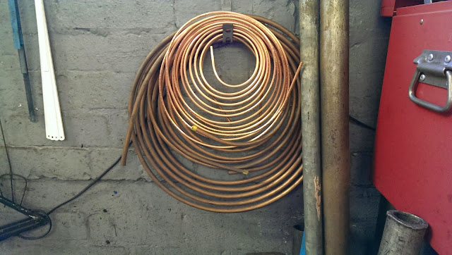
A roll of brake pipes
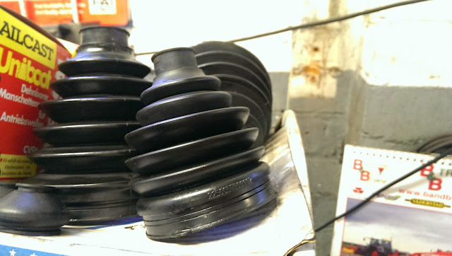
Rubber seals 
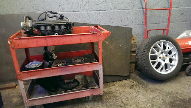
Tool trolley
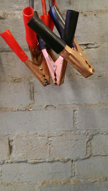
Jump leads
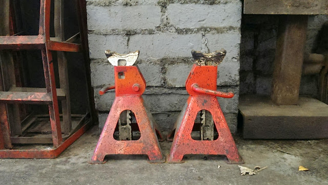
Jacks

Here are some photographs that I took whilst walking around my dad's garage. I liked looking more closely at things and seeing interesting shapes with the parts. 
The rustic and dirty look of the garage adds to the whole feel of the objects I photographed, as they are quite old and rusty. 

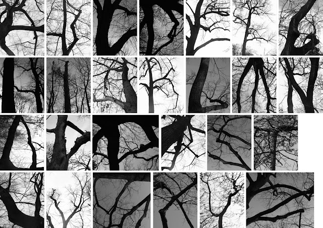
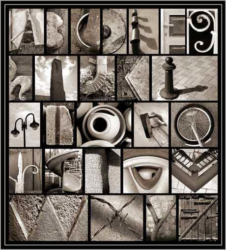
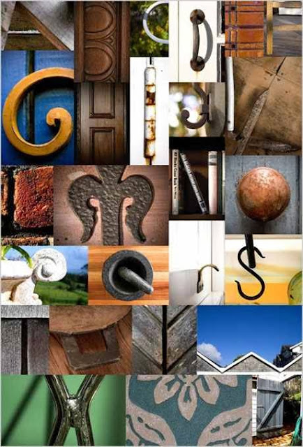
Typography photographers

Monday 11 November 2013

Recording my flower

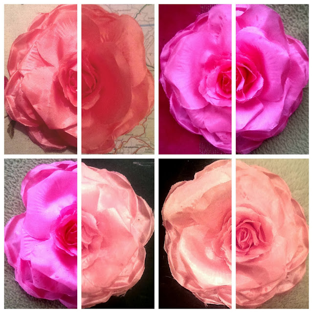
I also recorded my flower broach by photographing it on different backgrounds and in different lighting. 
I used my mobile to arrange my photographs, starting with merging two photographs together to look like one. I like how the colours change due to the different lighting in each room of my house. Plus the range of backgrounds give the photos another element of interest.


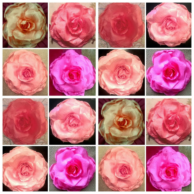
Here I put all the photographs I took together in a uniformed collage. I like how it looks symmetrical, even though it is not, and the different photographs compliment each other and create an overall evenly distributed range of tones.

Skeleton flower - Henry Moore Style

During the experimental stage of the course I looked at an object that interested me. I chose a flower broach and recorded it in different ways. I like the idea of sketching the outline of it firs (like a skeleton drawing), then filling in the tone using 'doodly' type lines. Like Henry Moore does in his work. 


In my sketchbook I experimented putting different materials or patterns or colours underneath these drawings. I preferred muted tones of the actual flower (concentrating on darker and lighter tones), as it seemed to add to the depth of the drawing. It also seemed to match up with the fineliner drawings i did over it...
Above, I tried to add different colours into the fineliner drawing, and found that it looked better when I kept it to a minimum, especially if I was going to put blocks of colour underneath.
Above, I have already recorded the tones of the flower in pinks and whites, but kept it very muted so that it doesn't overpower the drawing. After that I drew the outline of the flower and have started to fill in the tones in a Henry Moore style. I think the finished drawing will be very effective.

The drawing will be posted when finished.

Sunday 10 November 2013

Head to head - Big Draw

For the big draw I changed A paper bag to make it look like a head. I chose an animal (tiger) and used coloured pencils, graphite and felt pen.
The bag needed look like someone's head if they wore it, so I chose to make it so it could be worn on the front of the face, instead of the usual way of just putting over the peron's head. (like a mask).
It looks quite bold and the fact the tiger is roaring makes it stand out even more. It obviously looks most effective if the person stands sideways on...